muto is a tumblr started in 2011, an office and a pseudonym. As a tumblr is a recollection of low resolution digital fragments.
![]()
![]()
![]()
![]()
![]()
![]()
GALLERY GALLERY TALKS
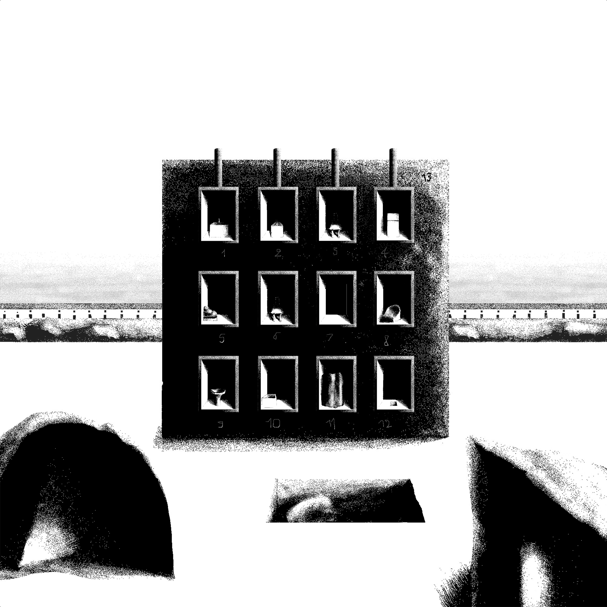
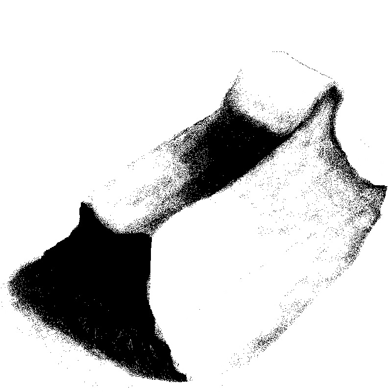
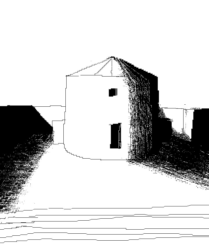
(MUTO)There are two themes that often recur in the preparation of my drawings: low resolution and shadow. These are common in the representation of architecture and in sacred architecture. There is an image I love from Napoleon’s expedition to Egypt. It is the redrawing of a doorway in the Valley of the Kings and Queens. The image is set up like an elevation in which the natural drawing of the stone and the architecture fuse together. It is almost impossible to capture the full complexity of the stone unless one undertakes a deep exercise in copying reality. In this drawing the author performs a reduction. The stone is rendered with a few lines that let you intuit the exact point where the passage from nature to myth takes place. This reduction, which for me also becomes a reduction of the stroke and of resolution, has long been fundamental in architectural representation. It gives technical clarity and synthesis, and it also deliberately invites the error in the viewer and an open-ended reading of the image. I place on the same level the reduction of the stroke and the loss produced by compression. Non definition and low resolution are sometimes completed by our brain with a sense of strangeness. When Hito Steyerl writes In Defense of the Poor Image in 2009 she considers the accumulation of poor images, the ground of what our Internet has become, a source of freedom and a subproletarian component that mocks the high definition of screens and digital cameras, a high definition associated with the prestige of advanced technology and with the absence of free interpretation. Returning to the representation of the doorway, a second element in the image draws me in. The surprise in my case occurs when we observe a black liquid, a kind of oil that clings to the drawing, rests on the stone, extends over the architecture, until it swallows completely that void which is the threshold of access to the tomb. Shadow is a viscous substance, a slime that scorches the drawing, hides everything, and what it does not touch, it leaves to burn in the white light of the sun. I realize
(MUTO)As I grew up, I watched with nostalgia the disappearance of the first software I used. I began to take an interest in recovering a sub-genre of lost software: abandonware, products no longer commercially relevant, no longer purchasable, that had lost support from their creators. I was not particularly interested in reviving the aesthetics of these programs, but in reliving that strangeness present in the first sounds, the first colors, the first interactions with technology.
(GG)What’s next?
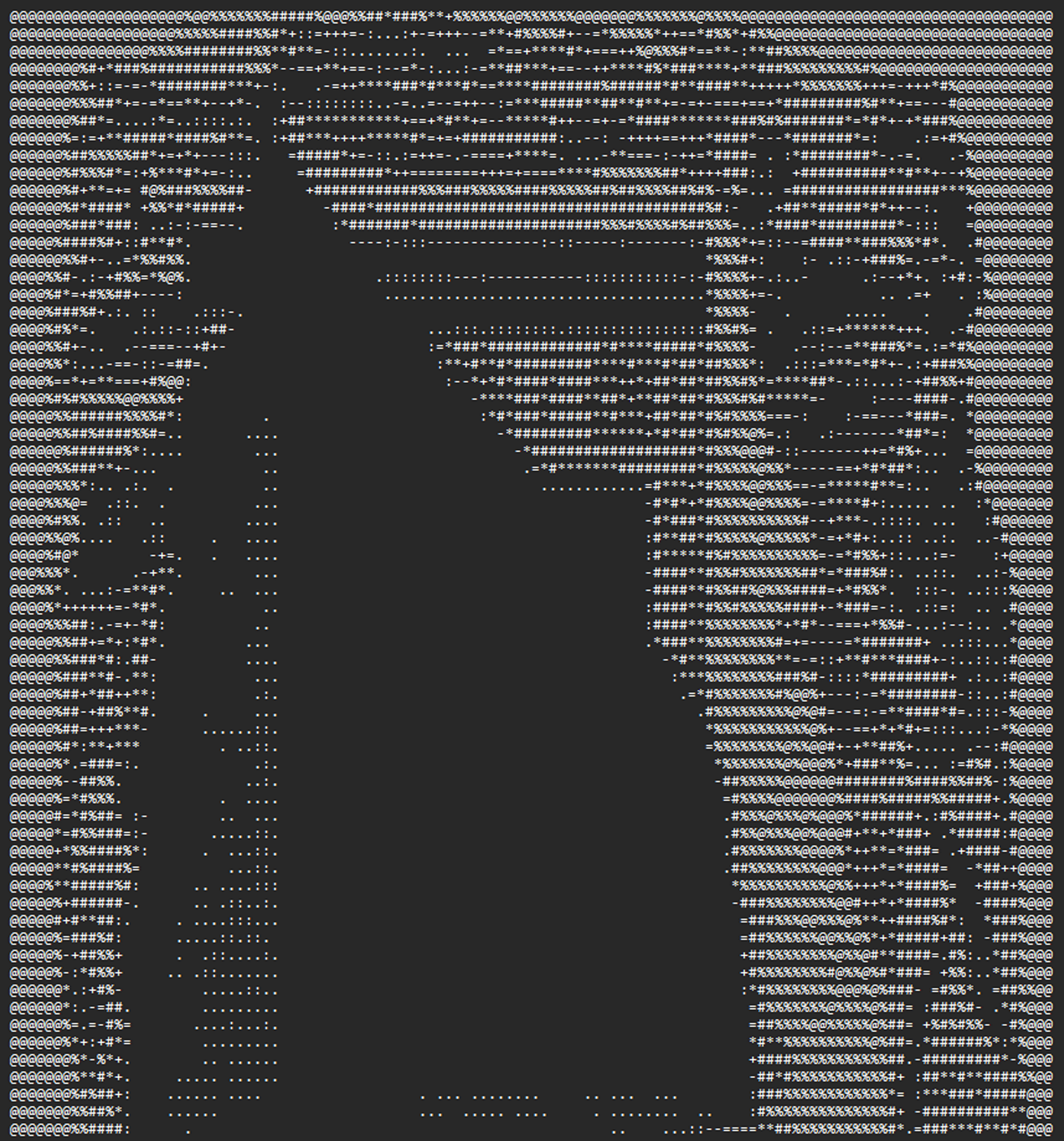 ASCII_Tomb_Drawing_A4.txt